“Bettman has only a marginal interest in the weaker teams. He only wants the NHL to make a bigger profit as a whole.” -- Dominik Hasek
Showing posts with label Capitals. Show all posts

February 7, 2008

Capitals Excitedly Surging Toward Major Playoff Disappointment

You know that now-old comparison between arguing on the Internet and running in the Special Olympics? Well, the same can be applied to winning the Southeast Conference (and its associated top-3 seed in the Eastern Conference playoff bracket).

The Capitals have improved significantly, as of late, and that's gotten the heads a-talkin'. The local boys are seeing stars. The big guns are lining up with pats on the back and whatnot. The bad news is, it's all going to end with a serious let-down.

Remember the Penguins last season? They made the playoffs with Crosby at the helm, only to get royally stomped in the first round when it dawned on them that they were just a mediocre team with a few really talented, inexperienced little kids in the lineup. Before their implosion, everyone was already convinced it was Their Year. Uh, no.

Maybe it's just me. Maybe a team still barely above .500 with less than 60 points in the standings and less than 30 games left to play, is destined to win the Cup. Or maybe the city of Washington hasn't had anything sports-related to cheer about in a while.

Read More...

June 24, 2007

Jersey Redesign For The Washington Capitalszzzzzz...


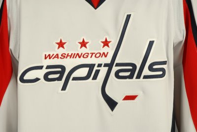
On the first day of the NHL Entry Draft, last Friday, the Washington Capitals unveiled their new RBK Edge jerseys for public consumption. While Capitals fans seem to like them, I'm perfectly comfortable admitting my absolute lack of excitement for the new designs. They couldn't be more boring.

Everything good about the old-school Washington sweaters of years gone by and even the redeeming qualities of the most recent incarnations have been abandoned for a new, sterile and socceresque aesthetic.

Please, follow me on a quick stroll down memory lane with the Washington Capitals.


When the Capitals became an NHL team in 1974, they did so with one of the brightest, most recognizable uniform designs of all time---white pants. Sure, that ill-advised and never-duplicated fashion faux pas didn't last long (one season), but it was memorable, something that can't be said about the new RBK Edge uniforms.

For many years, the Capitals relied on the red-white-blue color palette for their team identity. With a few small variations, the jerseys and team logo remained fairly static. Below (in the order that they appear) is the road jersey from 1985 and the home jersey of 1993:


Not bad, but the horizontal stripes across the stomach tended to dominate a player's body and overpower the eye. And really, all those bright colors and the stars on the pants were a bit busy. Just too much to take in all at once. The various individual pieces of the uniform were solid as far as hockey designs go (horizontal stripes on the jersey, striped socks, blue pants), but not great all together.

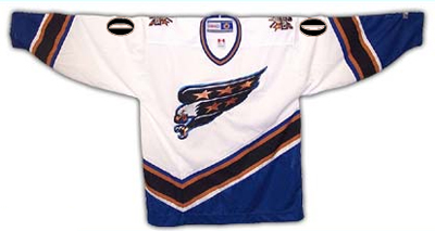
Nothing much changed for two decades until the lockout of 1994-95. The following season, like many other teams, the Capitals unveiled entirely new designs for their jerseys and team logo:


Both the white and the dark version featured the word "Capitals" written across the waist. The diagonal sleeve stripes and the odd crooked line across the lower half were a significant departure from hockey tradition, not to mention the long precedent set by the Capitals themselves.

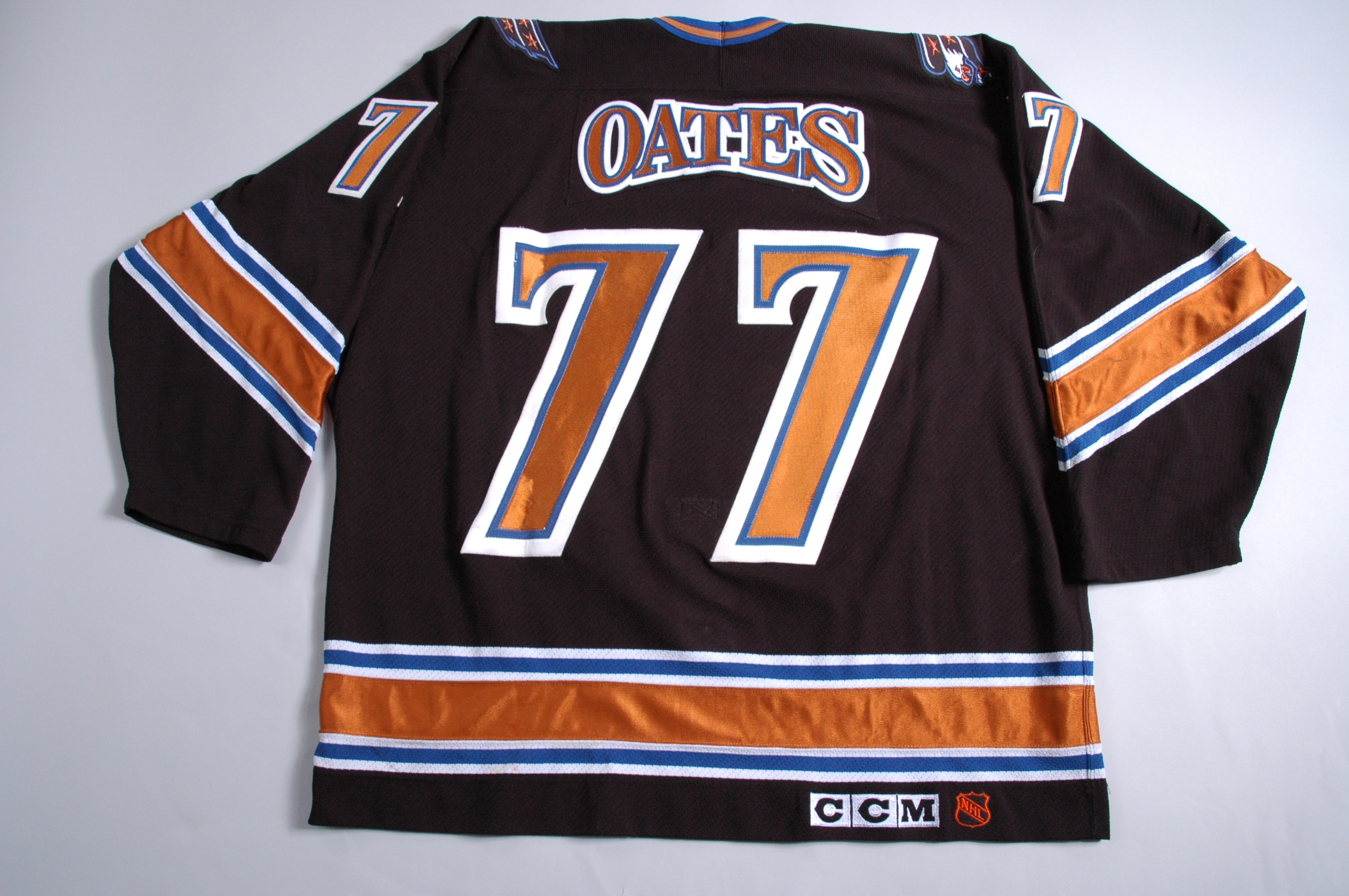
The home and away jerseys remained the sole options for the team until the 1997-98 season, when Washington introduced a new black jersey as an alternate (featuring truly unique arching for the nameplates):


This black version became the primary dark jersey in 2000-01 (a white version was used in team practices). The already existing white jersey lost the word "Capitals" from the front but was still in use for home games. The long tradition of red, white and blue, stars and stripes, and all the other patriotic garb was obviously gone for good. What remained were cartoony logos featuring a diving eagle, the US Capitol dome and a couple of gold (bronze?) stars. Wearable, but nothing to write home about.

Now enter the RBK Edge.


The red-white-blue scheme has returned, along with a modern take on the traditional Capitals logo (complete with hockey stick "t"), but minus most of the stars and the bold horizontal waist stripes of old. With the exception of a small red area at the bottom, all the stripes on the new white jersey are vertical, and dominate the sleeves.

The dark jersey is very similar, but is almost entirely red, a color already prominently worn by eleven other NHL clubs.


There's really not much going on with these new jerseys, and overall they're pretty dull. They're not offensive to behold like white pants and huge alternating color stripes, but they're not very memorable, either.

The only interesting feature of the entire new design is the shoulder patch logo, in which an eagle with outstretched wings creates a silhouette of the US Capitol Dome. Paul at Uniwatch thinks the patch looks too much like the Pontiac Firebird logo, but I don't think it's all that bad---especially since it's the only remotely exciting thing to be found.

Overall, a dull, fairly uninspired update for the Caps. Not that they had a lot to work with, mind you, but they could have come up with something a little more hockey-like and a little more eye-catching.

Teebz runs through the basic elements, and ultimately gives the new design a thumbs-up.

Can't say I agree with him, but it's not the worst route the Capitals could have gone, that's for sure.

For more photos, info and documentation concerning the uniform history of the Washington Capitals, see CapsJerseys.com.

Read More...

March 26, 2007

Olie The Goalie: Still Great?


It's not easy being Olaf Kolzig. While he does play behind young scoring aces Alexander Ovechkin and Alexander Semin, his team has no defense to speak of. Opposing teams literally pepper him with shots each and every game, and yet he somehow manages to maintain his composure and put up decent numbers, considering. Not convinced? Let's do some math.

Kolzig currently boasts a .910 save percentage with a 3.03 goals against average in 50 games played. His save percentage is good, but his GAA is fairly bad.

Comparing Kolzig's basic goaltending stats to others in the league is a bit misleading, though, especially since Kolzig has only won 21 games in 50 played. That's really low. What isn't on most stats lists, however, is the most telling of all numbers for goalies: Average shots faced per game. Kolzig faces an average of 33 shots per game! The top goalies, like Brodeur, Luongo and Kiprusoff, face no more than 29 on average. And they actually have decent defensemen blocking and checking the puck in front of them, so Kolzig is already at a disadvantage in that regard.

A more accurate picture, however, can be drawn by comparing Kolzig to other goalies who have played a similar number of games. Brodeur and Luongo have played 70 games or more, so instead we must look at guys like Jean-Sebastien Giguere (53 GP), Ray Emery (53 GP), Peter Budaj (52 GP) and Fredrick Norrena (49 GP). Of those four, only Emery faces 29 shots per game on average, while the other three face 26. That's 7 shots fewer on average than Kolzig, whose save percentage is still higher than those of Budaj and Norrena. Further, Kolzig has made around 300 more saves than both of those guys in about the same number of games!

Simply put, Olaf Kolzig is still one of the very best goaltenders in the NHL, and if not for his team's complete lack of defense, he would actually enjoy the success he deserves.

No offense to Peter Budaj, who's really come into his own in recent games, but how much damage could the Avalanche do next year with Kolzig in net? Too bad that won't happen.

Read More...

Topic Guide

 
template by free-web-template.blogspot.com