“Bettman has only a marginal interest in the weaker teams. He only wants the NHL to make a bigger profit as a whole.” -- Dominik Hasek
Showing posts with label uniforms. Show all posts

September 13, 2007

New Uniforms: Toronto Sticks To Tradition, Colorado Screws The Pooch

Well, there were two RBK Edge "uniform system" unveilings yesterday, with one being a minor success and the other an unmitigated disaster.

First of all, let me congratulate the five of the Original Six for their conservative approach to the new jersey designs. Sure, some would argue that the past is boring, but the past is what gives all professional sports the meaning they have. That and steroids. But mostly it's a respect for tradition that ties fans together and gives a sport its cultural weight. Boston, the Rangers, Detroit, Montreal and now Toronto have all maintained their uniform traditions with subtle, hard-to-notice changes to old-school looks. Response among Maple Leafs fans has been generally positive so far. The Blackhawks, the only team that could conceivably ruin the streak, release their new look tomorrow on September 14th. Let's hope for the best.

On the flip side is the Colorado Avalanche. They screwed up big time. Like Florida, Nashville and the Islanders before them, they went in an entirely wrong direction with the new look of their uniforms. For a complete breakdown, check out my post at Mile High Hockey. It's a bloodbath, let me warn you.

There are still eleven teams to reveal their new looks. Let's hope for the best but expect the worst---something, say, Blackhawks fans will have no trouble with.


Ballhype: hype it up!Digg!

Read More...

July 30, 2007

Panthers Will Likely Play Poorly Again Next Season, Look Worse


The Florida Panthers have really outdone themselves this time. For a team that hasn't really enjoyed success since their appearance in the Stanley Cup Finals back in 1996 (Colorado swept them in four games), they sure don't look too interested in achieving any kind of future glory. Other than signing a really good goalie in Thomas Vokoun, they've more or less got the same batch of minor leaguers they did before.

And, like the Nashville Predators and Columbus Blue Jackets before them, they'll not only suck at playing hockey, they'll also suck aesthetically.

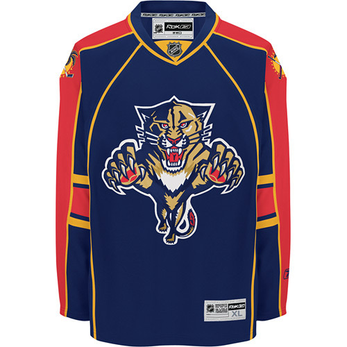
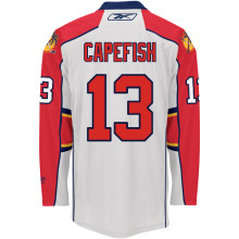
The Panthers unveiled their new uniforms last week (home and away), and boy oh boy are they rotten. Not only did they go with the "apron" style of useless front piping that the Predators adopted, but they've also been suckered (by Reebok, perhaps?) to allow what Paul at UniWatch refers to as "contrast-colored logo creep" to dominate the back of the jerseys. Gross.

The only thing worse would be contrasting vertical and horizontal sleeve stripes. Oh wait, they did that too. The overall color scheme is fine (red, black and yellow has served the Calgary Flames well for years), but the orgy of piping, stripes and unflattering lines in general just makes for one really ugly jersey style.

Lame, Florida. Lame.


Ballhype: hype it up!Digg!

Read More...

July 23, 2007

We're All Invited To The Nashville BBQ, Suck Fest


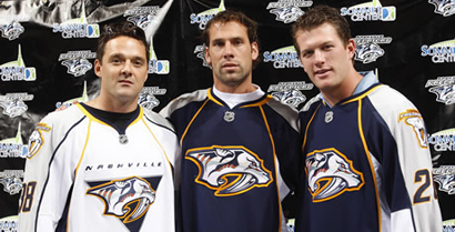
The Nashville Predators unveiled their new RBK Edge uniforms last week, and, due to an ill-timed out-of-town excursion, I was unable to offer my opinion when it immediately came spewing forth from my mind.

My initial impression of the new jerseys was to ask, "Why the hell are the Predators wearing aprons?" Unfortunately, because I hesitated, somebody beat me to it.

That somebody is the illustrious Teebz, whose opinion is more or less identical to my own on the Hamilton/Kansas City/Nashville Predators' new look. In sum, it sucks. Just like the team is going to this coming season.

I'm not even going to justify their aesthetic cop-out by posting a lengthy analysis of the new uniforms. Instead, I'm going to go buy dirt-cheap tickets to their game against the Avalanche on October 4th so I can mock the Predators in person.

Read More...

June 25, 2007

Blue Jackets Can't Win, Won't Look Good While Losing


I have to admit something: I like the Columbus Blue Jackets. They're never any good, their "stars" never quite perform up to their abilities, and the general management---at least to date---has never really been competent. But they're an endearing bunch, and they try hard, and their fans love them. I don't live in Ohio but my cable provider carries Fox Sports Ohio, so I watch a lot of Jackets games each season. I have to admit they've grown on me.

But while the team as a whole and the fans in general have become like friends to me, I have never been satisfied with how the Jackets looked on the ice, and the new RBK Edge uniforms for the team aren't really an improvement, either.


The Columbus Blue Jackets have only been around since the 2000-01 season, so they don't have a long aesthetic history. What they do have isn't that impressive, either, so they can only really go up from here---unfortunately, it's more like they're treading water.

From their inaugural season until 2006-07, the Blue Jackets have worn these jerseys:


They had the right idea with the horizontal waist stripes, but the color palette has never been that bold or eye-catching. A lot of blue, some red, and that's about it. And the primary team logo has always left much to be desired. Why the bizarre font? Why all the stars? If the original logo was meant to emulate the Ohio state flag, it was four stars short of the seventeen used to represent Ohio's place as the seventeenth in the United States. In general, the original logo (now retired with the new RBK Edge uniforms) was rotten.

The original alternate logo of the team wasn't any better. While the name "Blue Jackets" is understood to be a reference to Union soldiers from the American Civil War, a war in which the state of Ohio sent thousands upon thousands of troops, the team originally tried to create a fictional insect, a blue jacket (like yellow jacket), to be the mascot. The original alternate logo looked as such:


Lame. Sure, the bug is wearing what appears to be a Union uniform and holding the hockey stick like a rifle, but it's cartoonish and silly. Apparently, this dawned on Blue Jackets management because 2004 was the last year the bug was used. After the lockout of 2004-05, Columbus adopted two new logos, a replacement for the bug on the shoulder patches and a new alternate primary logo for a third jersey. First, the new shoulder logo:


Of all of Columbus' logos, this is by far the best. It is far less cartoonish or childish, directly relates the team name to its historical reference, and is simple but still memorable, specifically through the use of crossed hockey sticks in place of rifles on the cap. All in all, a solid team logo.

The new "alternate" primary logo that entered use in 2005, on the other hand, leaves much to be desired:


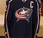
Not much of an improvement from the original dark and white Columbus jerseys, really, and the new logo looked generic. The Ohio state flag (kind of) sweeps around a large silver star to form a "C" for Columbus. But the "C" doesn't really pop out at you, and the flag is missing some stars as well---it only has twelve. With the six stars on the sleeves (three on each side), the total comes to 18, which is one too many if an accurate representation of the state flag is the point.

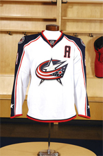
Despite the obvious weaknesses of this logo, it has been adopted as the new primary logo of the Blue Jackets, and will appear on both dark and white RBK Edge jerseys:


Both jerseys are unbelievably boring, featuring only minimalist sleeve stripes, no horizontal striping at all (the tiny lines along the bottom front don't count), and a boring color scheme for each: all or nothing. The dark jersey is all blue, the white jersey is almost all white. They both look exceedingly sterile. And as for stars, the logo again features only twelve, and the sleeves have one each, so the connection to the actual Ohio state flag, which the logo is supposed to emulate, is just plain lazy at best. Is this nitpicking? Not if the expressed purpose of the logo is to represent the state in which the team plays.

The only redeeming quality is the inclusion of the shoulder logo featuring the Union cap with the crossed hockey sticks.


Personally, I would have chosen that as the primary logo and used the flag/star emblem on the shoulders, but that's just me. I still haven't been offered a job in Blue Jackets management, so until then, I can only make suggestions.

Overall, I'm disappointed by the result of the Blue Jackets' redesign efforts. Both Columbus and Washington have failed to impress me, and Boston remains the one true success so far.

If you just can't get enough of the new Columbus jerseys, check out fellow Avs blogger Tapeleg trying one on. His photos show up close how lousy the faux-futuristic nameplate typeset is as well. The number font is fine, but the names just look silly to me. So, if I had to give a rating, I would give the new Columbus jerseys five stars (out of 14).

Read More...

June 24, 2007

Jersey Redesign For The Washington Capitalszzzzzz...


On the first day of the NHL Entry Draft, last Friday, the Washington Capitals unveiled their new RBK Edge jerseys for public consumption. While Capitals fans seem to like them, I'm perfectly comfortable admitting my absolute lack of excitement for the new designs. They couldn't be more boring.

Everything good about the old-school Washington sweaters of years gone by and even the redeeming qualities of the most recent incarnations have been abandoned for a new, sterile and socceresque aesthetic.

Please, follow me on a quick stroll down memory lane with the Washington Capitals.


When the Capitals became an NHL team in 1974, they did so with one of the brightest, most recognizable uniform designs of all time---white pants. Sure, that ill-advised and never-duplicated fashion faux pas didn't last long (one season), but it was memorable, something that can't be said about the new RBK Edge uniforms.

For many years, the Capitals relied on the red-white-blue color palette for their team identity. With a few small variations, the jerseys and team logo remained fairly static. Below (in the order that they appear) is the road jersey from 1985 and the home jersey of 1993:


Not bad, but the horizontal stripes across the stomach tended to dominate a player's body and overpower the eye. And really, all those bright colors and the stars on the pants were a bit busy. Just too much to take in all at once. The various individual pieces of the uniform were solid as far as hockey designs go (horizontal stripes on the jersey, striped socks, blue pants), but not great all together.

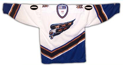
Nothing much changed for two decades until the lockout of 1994-95. The following season, like many other teams, the Capitals unveiled entirely new designs for their jerseys and team logo:


Both the white and the dark version featured the word "Capitals" written across the waist. The diagonal sleeve stripes and the odd crooked line across the lower half were a significant departure from hockey tradition, not to mention the long precedent set by the Capitals themselves.

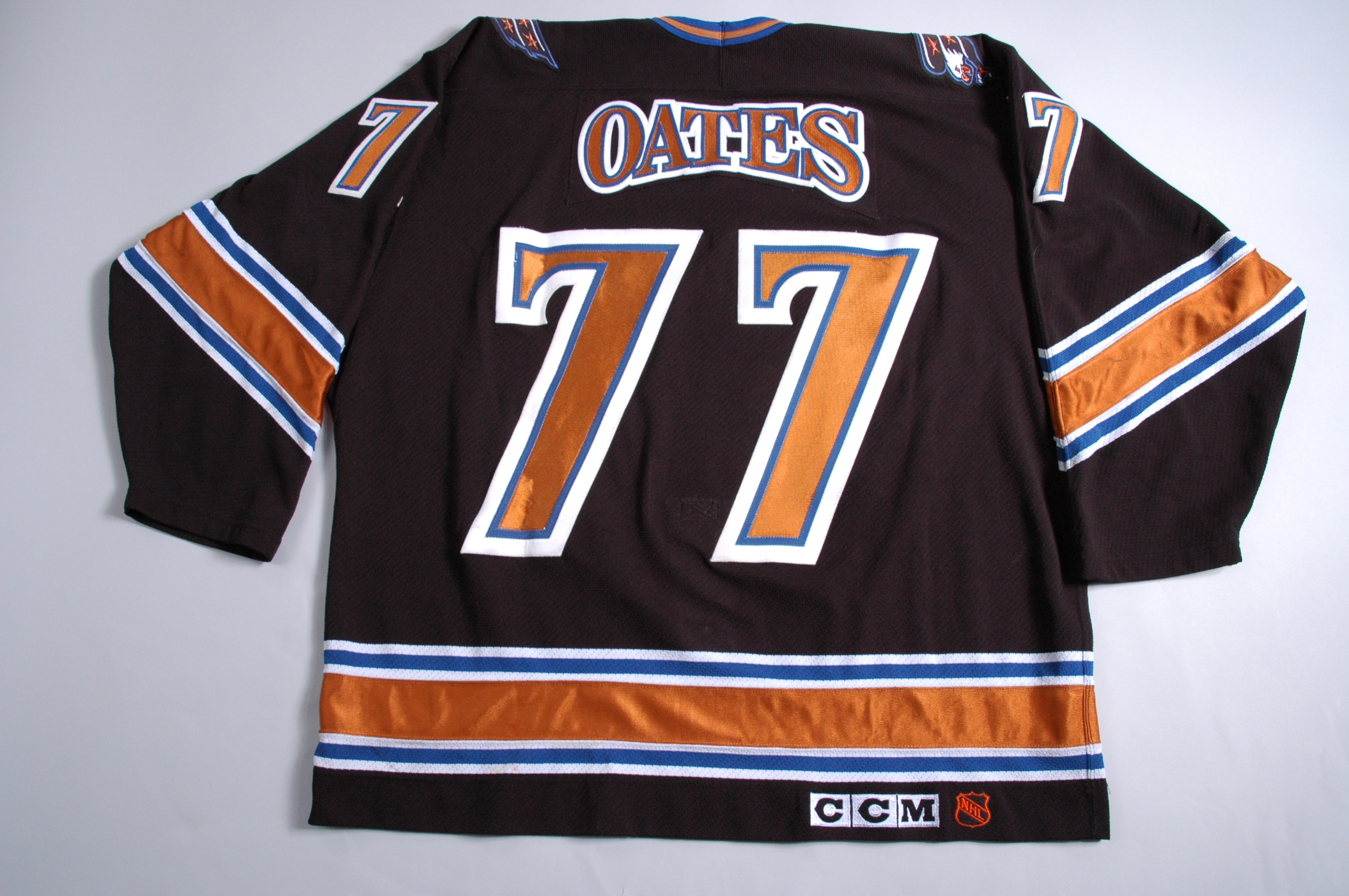
The home and away jerseys remained the sole options for the team until the 1997-98 season, when Washington introduced a new black jersey as an alternate (featuring truly unique arching for the nameplates):


This black version became the primary dark jersey in 2000-01 (a white version was used in team practices). The already existing white jersey lost the word "Capitals" from the front but was still in use for home games. The long tradition of red, white and blue, stars and stripes, and all the other patriotic garb was obviously gone for good. What remained were cartoony logos featuring a diving eagle, the US Capitol dome and a couple of gold (bronze?) stars. Wearable, but nothing to write home about.

Now enter the RBK Edge.


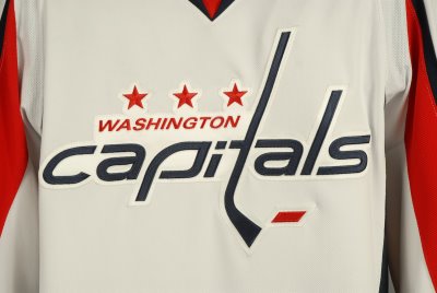
The red-white-blue scheme has returned, along with a modern take on the traditional Capitals logo (complete with hockey stick "t"), but minus most of the stars and the bold horizontal waist stripes of old. With the exception of a small red area at the bottom, all the stripes on the new white jersey are vertical, and dominate the sleeves.

The dark jersey is very similar, but is almost entirely red, a color already prominently worn by eleven other NHL clubs.


There's really not much going on with these new jerseys, and overall they're pretty dull. They're not offensive to behold like white pants and huge alternating color stripes, but they're not very memorable, either.

The only interesting feature of the entire new design is the shoulder patch logo, in which an eagle with outstretched wings creates a silhouette of the US Capitol Dome. Paul at Uniwatch thinks the patch looks too much like the Pontiac Firebird logo, but I don't think it's all that bad---especially since it's the only remotely exciting thing to be found.

Overall, a dull, fairly uninspired update for the Caps. Not that they had a lot to work with, mind you, but they could have come up with something a little more hockey-like and a little more eye-catching.

Teebz runs through the basic elements, and ultimately gives the new design a thumbs-up.

Can't say I agree with him, but it's not the worst route the Capitals could have gone, that's for sure.

For more photos, info and documentation concerning the uniform history of the Washington Capitals, see CapsJerseys.com.

Read More...

June 22, 2007

Bruins Unveil New Coach and Uniforms, Same Old Sucky Team


photo courtesy Elise Amendola/AP


The Boston Bruins unveiled two new aspects of the franchise on Thursday---a new coach and a new look.

Claude Julien, unjustly dismissed from his post as head coach of the 100+ point New Jersey Devils just before the playoffs, found a new home behind the bench with the struggling Bruins, who finished 13th in the Eastern Conference this past season. Julien proudly begins what will likely be a very short career in Beantown.

As for the uniforms, the Bruins became the first NHL team to unveil the new Reebok (RBK) Edge "uniform system" and logo re-design. Likely hoping to bring past glory back to Boston, the Bruins opted for slight changes to their color scheme and logos that recall the origins of the franchise.


The changes to the Bruins' uniform are worth analyzing in depth. First of all, the retired designs looked as such:


Simple enough, and one of the more tradition-friendly jersey styles in the NHL. The updated jerseys feature slight coloring changes, the addition of horizontal sleeve stripes, and a slightly modified primary logo:


Notice that the colored panels on the shoulders no longer extend to the end of the sleeves, while an additional panel has been added to the chest just below the shoulders. On the dark jerseys, this panel is white. On the white jerseys, the panel is gold. This recalls a design not seen on Boston uniforms since the 1974-75 season.

Also different is the order of colors in the waist stripes. On the old dark jerseys, the colors are white-gold-white, and on the new jerseys they are gold-white-gold. A similar alteration appears on the white jerseys.

The most significant change has to be the horizontal sleeve stripes, though, which recall the design worn by Bobby Orr in this 1966 photo. In fact, Boston jerseys had horizontal sleeve stripes throughout the history of the team until 1995-96, when many other teams also changed their uniform designs following the lockout of the prior season. Any homage to historic and traditional designs is A-OK in my book, so I definitely approve of the changes so far.

While the sleeve stripes are a major change, a more subtle and interesting modification appears in the logos, both the primary logo and the shoulder patches. The new primary logo---the letter B among the spokes of a wheel---is largely the same except for the addition of serifs. This was actually the same style used by the Bruins starting in the early 1930s until 1948. A sans-serif "B" has been in use since then. As for the shoulder patches, they are a brand-new design altogether, but bear (sorry, had to) a similar appearance to the original Bruins team logo.


Apparently, the shoulder patch design will also be used as the "alternate" team logo in the event that the now-defunct third jersey option is re-instituted in the NHL in the coming years.

Oh, and I'm a big fan of the lace-up style collars. Very nice.

Overall, I highly approve of the Bruins' new look, in that it's really a very old look. Though many seem to think that constant reinvention is a good thing, nothing beats good, old-school hockey uniforms when it comes to athletics aesthetics. Hopefully the Bruins can emulate the teams of old in more than just appearance. Right now they suck pretty bad.

For further reading, Teebz over at Hockey Blog In Canada has already posted his reaction to the new Boston uniforms. I'm really anxious for the verdict on all the new NHL outfits from Paul at UniWatch in the coming weeks, which I'm sure will be fascinating.

UPDATE: Paul posted an extremely favorable review of the Boston uniforms today, along with a not-so favorable review of the Capitals, based on a leaked shot of the new jersey. I'll do a detailed analysis of every team's new digs in the coming weeks, so I'll save my opinion on Washington until later.

Read More...

June 11, 2007

In Hockey, It's All About The Hot, Hot "C and A"


photo courtesy Legends Of Hockey

It's not easy to admit your vices, or, in my sorry case, addictions.

I'm addicted to the intricacies of professional sports uniforms. And amateur sports uniforms. And just about anything having to do with sports uniforms anywhere. I'm a hopeless devotee to the geekiest sports blog on the Internets (it's a series of tubes!)---
Uniwatch. So, it being a slow hockey news day and me being obsessively addicted to "athletics aesthetics", I decided to browse the various archived photos of the Stanley Cup winners at Legends of Hockey.

I found some interesting variations in the assignment of the Captain and Alternate Captain letterings. I first noticed something strange in the team photo for the 1995-96 Avs (also pictured above). There are four alternate captains. I know three of them are Curtis Leschychyn, Sylvain Lefebvre, and Adam Foote, but I'm unsure of the fourth guy. At any rate, four seems like an excessive number, considering the standard in the league is two.

But that's not the only strange instance of "C and A" that I've found. The 2000-01 Avalanche had three alternates: Ray Bourque, Adam Foote and Peter Forsberg. The 1988-89 Calgary Flames had two captains: Lanny McDonald and Jim Peplinski. The 1985-86 Montreal Canadiens had three alternates, the first year that designation officially existed in the NHL, which is why the 1984-85 Edmonton Oilers have only captain Wayne Gretzky wearing a letter on his jersey.

That's just the Cup winners. Who knows what kind of weird variations of captains and alternate captains have existed in the 20 seasons since both designations became standard uniform attire? As just one example, I know some teams have gone captainless in recent years (the Penguins). I wonder what the maximum number of alternates has been, and on what team? Anybody know?

Read More...

April 16, 2007

NHL Aesthetics Part 2: The Alternates

While watching Game 2 of the Vancouver-Dallas playoff series the other night, we noticed a peculiar site in the stands: a literal crap-ton of blue and green jerseys on the home fans. They were wearing the current "alternate" (see also: "third") jersey of the Canucks which is based on the very first design worn by the team that debuted in 1970.


They're definitely sharp. Far better than some other Canucks designs, that's for sure. Like many Canucks fans, we favor a return to these uniforms and a ditching of the silly orca design currently worn by the team. For anyone interested, this article follows the history of the Canucks' duds from Season One to today.

Some other alternate jerseys around the NHL are vintage throwbacks like those of the Canucks and some are newer creations. Other teams that have lucked-out in the third jersey department include the Avs, Sabres, Canadiens, Flyers, Leafs and Panthers.

As alternate jerseys go, those teams are pretty lucky. There are other teams that don't have it so good. Nashville comes immediately to mind, as do Edmonton and the Islanders. Gross.

However, none of the above quite compares to the absolute ultimate in horrible third jerseys: the infamous "Burger King" jersey worn by the Los Angeles Kings several times during the 1995-1996 season.


Wow. Gretzky actually had to put that thing on. Luckily that design didn't survive past the first year they were worn, and now the very few remaining game-worn jerseys fetch huge sums on auction sites.

There is one more example of an alternate jersey gone wrong that must be cited: the Atlanta Thrashers. The Thrashers stuck to the same two jerseys (white and navy) for several seasons, until 2003-2004, when their first alternate jersey was introduced. Somehow, since then, the alternate has replaced the original dark jersey to become the current choice of the team when they play at home. Sadly for them, it's not a pretty sight:


Seriously, what the hell? One sleeve is totally different than the other, and only one shoulder bears the player's number. The color choices are dull and the arrows across the waist are ugly as sin, not to mention the boring and uninspired team logo mucking up the chest area. Since the old Phoenix Coyotes jerseys have been retired, this takes the cake as the NHL's worst current jersey design.

So, in sum, some alternate jerseys, especially the vintage throwbacks like those of the Canucks (and Sabres, Canadiens and Leafs, too) are really great. Others, not so much. And some, like the Thrashers with their alternate-turned-home jerseys just have no chance whatsoever.

Read More...

April 14, 2007

NHL Aesthetics Part 1: The Buffaslug

Sometimes it is awkward for us to admit: we're fashonistas. Or, at least, a little obsessive about the aesthetic qualities of NHL uniforms and equipment. We care about what the players are wearing on the ice. We're not quite as obsessive as some about sports apparel and player appearances, but we're still pretty interested.

This is the first in a multi-part series where we will examine the sartorial specifics of teams around the NHL---where they've been, where they are and where they're going. With Reebok's major overhaul of the league's uniforms starting next season, what better way to usher out an old era and bring in a new than with a multi-part analysis? Gosh that sounds fun!

There's only one place to start, really, and that's with the Buffaslug™!!


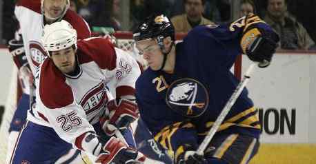
No other logo redesign has inspired as much wrath and hatred in the past few years than that of the Buffalo Sabres. Called the "Buffaslug" by many, the new logo replaces the more traditional (and appropriate) crest that featured a buffalo and two crossed sabres. It's definitely a mental stretch, but we guess it made sense. At any rate, the Buffaslug didn't go over very well with some fans.

The more traditional design is now used as an "alternate" jersey by the Sabres for occasional home games.

But despite the initial negative reaction to the new jerseys and logo design, a funny thing happened: sales went through the roof. In fact, for two straight seasons, Buffalo Sabres jersey sales have skyrocketed, consistently leading all other teams and players (other than Sidney Crosby, of course). It doesn't hurt that the team has been one of the best in the "New NHL" since the end of the lockout in 2004-2005, and it also doesn't hurt that the team boasts some seriously hot players like Daniel Briere, Chris Drury, Ryan Miller and Maxim Afinogenov. A third factor working in Buffalo's favor is that jersey and logo redesigns frequently trigger increased sales as dedicated fans update their team wardrobes.

To be honest, we hate the Buffaslug and the new jerseys in general. We don't like the "streamlined" look, we don't like the colors and we don't like the logo. Other than the ugly Slug, the Sabres' jerseys are pretty boring overall. The trend away from bolder, more traditional team colors and logos is a bad one, if you ask us. While constantly changing uniforms may boost apparel sales in the short run, it damages the long-term "brand identity" of each team---and this identity is bigger than just merchandising. It translates into life-long fans. People who spend money on the teams their entire lives, not just for a couple of seasons while they're hot.

If the Sabres really wanted to look good on the ice, they would have considered a more traditional update like the one proposed by graphic designer John Slabyk, whose "New Blue And Gold Project" was truly impressive. Tradition and aesthetic appeal---a great combination.

Read More...

Topic Guide

 
template by free-web-template.blogspot.com