Blue Jackets Can't Win, Won't Look Good While Losing

I have to admit something: I like the Columbus Blue Jackets. They're never any good, their "stars" never quite perform up to their abilities, and the general management---at least to date---has never really been competent. But they're an endearing bunch, and they try hard, and their fans love them. I don't live in Ohio but my cable provider carries Fox Sports Ohio, so I watch a lot of Jackets games each season. I have to admit they've grown on me.
But while the team as a whole and the fans in general have become like friends to me, I have never been satisfied with how the Jackets looked on the ice, and the new RBK Edge uniforms for the team aren't really an improvement, either.
The Columbus Blue Jackets have only been around since the 2000-01 season, so they don't have a long aesthetic history. What they do have isn't that impressive, either, so they can only really go up from here---unfortunately, it's more like they're treading water.
From their inaugural season until 2006-07, the Blue Jackets have worn these jerseys:
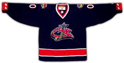

They had the right idea with the horizontal waist stripes, but the color palette has never been that bold or eye-catching. A lot of blue, some red, and that's about it. And the primary team logo has always left much to be desired. Why the bizarre font? Why all the stars? If the original logo was meant to emulate the Ohio state flag, it was four stars short of the seventeen used to represent Ohio's place as the seventeenth in the United States. In general, the original logo (now retired with the new RBK Edge uniforms) was rotten.
The original alternate logo of the team wasn't any better. While the name "Blue Jackets" is understood to be a reference to Union soldiers from the American Civil War, a war in which the state of Ohio sent thousands upon thousands of troops, the team originally tried to create a fictional insect, a blue jacket (like yellow jacket), to be the mascot. The original alternate logo looked as such:
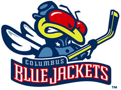
Lame. Sure, the bug is wearing what appears to be a Union uniform and holding the hockey stick like a rifle, but it's cartoonish and silly. Apparently, this dawned on Blue Jackets management because 2004 was the last year the bug was used. After the lockout of 2004-05, Columbus adopted two new logos, a replacement for the bug on the shoulder patches and a new alternate primary logo for a third jersey. First, the new shoulder logo:
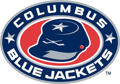
Of all of Columbus' logos, this is by far the best. It is far less cartoonish or childish, directly relates the team name to its historical reference, and is simple but still memorable, specifically through the use of crossed hockey sticks in place of rifles on the cap. All in all, a solid team logo.
The new "alternate" primary logo that entered use in 2005, on the other hand, leaves much to be desired:
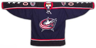
Not much of an improvement from the original dark and white Columbus jerseys, really, and the new logo looked generic. The Ohio state flag (kind of) sweeps around a large silver star to form a "C" for Columbus. But the "C" doesn't really pop out at you, and the flag is missing some stars as well---it only has twelve. With the six stars on the sleeves (three on each side), the total comes to 18, which is one too many if an accurate representation of the state flag is the point.
Despite the obvious weaknesses of this logo, it has been adopted as the new primary logo of the Blue Jackets, and will appear on both dark and white RBK Edge jerseys:

Both jerseys are unbelievably boring, featuring only minimalist sleeve stripes, no horizontal striping at all (the tiny lines along the bottom front don't count), and a boring color scheme for each: all or nothing. The dark jersey is all blue, the white jersey is almost all white. They both look exceedingly sterile. And as for stars, the logo again features only twelve, and the sleeves have one each, so the connection to the actual Ohio state flag, which the logo is supposed to emulate, is just plain lazy at best. Is this nitpicking? Not if the expressed purpose of the logo is to represent the state in which the team plays.
The only redeeming quality is the inclusion of the shoulder logo featuring the Union cap with the crossed hockey sticks.
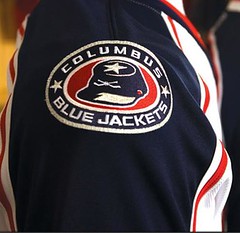
Personally, I would have chosen that as the primary logo and used the flag/star emblem on the shoulders, but that's just me. I still haven't been offered a job in Blue Jackets management, so until then, I can only make suggestions.
Overall, I'm disappointed by the result of the Blue Jackets' redesign efforts. Both Columbus and Washington have failed to impress me, and Boston remains the one true success so far.
If you just can't get enough of the new Columbus jerseys, check out fellow Avs blogger Tapeleg trying one on. His photos show up close how lousy the faux-futuristic nameplate typeset is as well. The number font is fine, but the names just look silly to me. So, if I had to give a rating, I would give the new Columbus jerseys five stars (out of 14).


8 comments:
I don't really think about them much, unless Colorado is playing them. When I do think of them, I'm usually doing so with pity. It has to be tough for the only real notable even in your franchise's history is the tragic death of a fan.
I do like the jerseys overall. That logo is a huge upgrade to that gaudy crappy CB thing they were using before. It's probably low on the list of jerseys I'd buy, but it is, at least, a big improvement.
Looks like a confused Washington Caps Jersey. Maybe they should be called the Columbus Freedom of America or Hitchock's Heroes....?
As a team, you will see an improvement because of our Kenny boy coach. the dumbest move in hockey for the philly flyers was getting rid of Hitchcock.
Back to the jerseys, a little too superhero for me.
tdr
I like the Blue Jackets too. Maybe it was my time there as a student, and the realization that it would be a GREAT hockey town if they could just win some games. I mean they were near sell-outs and they sucked badly when I went to a few games at Nationwide Arena.
They have a good coach, hopefully new management will get them up and going and into the playoffs... Rick Nash is a great player who should break out into a star soon.
Dear Mr,
I'm an intern with startup widget 1000 and I created a news widget for Columbus Blue Jackets News.
It's updated every hour with Columbus Blue Jackets headlines from several different sports websites like ESPN, FOX Yahoo,etc. (Take a look: http://www.widget1000.com/)
Can we add Columbus Blue Jackets blog to the widget,too? That means that every time you post to your blog the headline of the post will show up on the widget and link directly to your post.
Anyone who puts this widget on their start page or on their website will see your Columbus Blue Jackets posts too. It's a powerful and free way to publicize your site.
Finally, would you add your Columbus Blue Jackets News Widget to your site so that others can see it?
Everyone who grabs the widget will automatically link to you so it's great for your search engine rankings. Plus, it shows a lot of stories about Columbus Blue Jackets and since it's updated every hour it is fresh and will make your site even more appealing than it already is.
What do you think?
Go Columbus Blue Jackets
Anthony Bremond
This blog is amazing!!!i stay impressive with the whole information because is absolutely interesting. Simply wonderful. i love all the jackets style ,because it drive me crazy. I love to buy different kind of colours. Actually when i see my boyfriend wearing a new jacket is because he went to
buy viagra
Well one type of winter jacket or coat that always looks fashionable is a wool coat. These coats usually come in a three quarter length rather than a full length or waist style jacket and this is more practicle for girls as they can't always cope with full length coats. Wool coats are excellent at keeping out the cold winds of winter and have some great designs.
ppe suppliers
I like the blue jacket its designing and color is too much fantastic...
Reflective Motorcycle Vests
I would like to appreciate your efforts that bring really nice work and also engage all people here to take opportunity for share their views.
San Antonio Roofing Companies
Post a Comment