

NHL Aesthetics Part 2: The Alternates
While watching Game 2 of the Vancouver-Dallas playoff series the other night, we noticed a peculiar site in the stands: a literal crap-ton of blue and green jerseys on the home fans. They were wearing the current "alternate" (see also: "third") jersey of the Canucks which is based on the very first design worn by the team that debuted in 1970.
They're definitely sharp. Far better than some other Canucks designs, that's for sure. Like many Canucks fans, we favor a return to these uniforms and a ditching of the silly orca design currently worn by the team. For anyone interested, this article follows the history of the Canucks' duds from Season One to today.
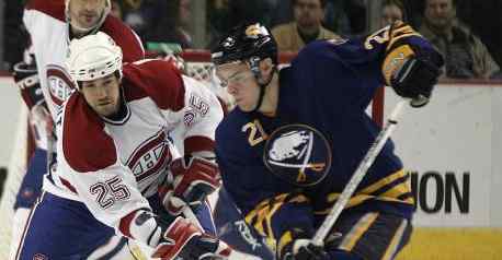
Some other alternate jerseys around the NHL are vintage throwbacks like those of the Canucks and some are newer creations. Other teams that have lucked-out in the third jersey department include the Avs, Sabres, Canadiens, Flyers, Leafs and Panthers.
As alternate jerseys go, those teams are pretty lucky. There are other teams that don't have it so good. Nashville comes immediately to mind, as do Edmonton and the Islanders. Gross.
However, none of the above quite compares to the absolute ultimate in horrible third jerseys: the infamous "Burger King" jersey worn by the Los Angeles Kings several times during the 1995-1996 season.

Wow. Gretzky actually had to put that thing on. Luckily that design didn't survive past the first year they were worn, and now the very few remaining game-worn jerseys fetch huge sums on auction sites.
There is one more example of an alternate jersey gone wrong that must be cited: the Atlanta Thrashers. The Thrashers stuck to the same two jerseys (white and navy) for several seasons, until 2003-2004, when their first alternate jersey was introduced. Somehow, since then, the alternate has replaced the original dark jersey to become the current choice of the team when they play at home. Sadly for them, it's not a pretty sight:

Seriously, what the hell? One sleeve is totally different than the other, and only one shoulder bears the player's number. The color choices are dull and the arrows across the waist are ugly as sin, not to mention the boring and uninspired team logo mucking up the chest area. Since the old Phoenix Coyotes jerseys have been retired, this takes the cake as the NHL's worst current jersey design.
So, in sum, some alternate jerseys, especially the vintage throwbacks like those of the Canucks (and Sabres, Canadiens and Leafs, too) are really great. Others, not so much. And some, like the Thrashers with their alternate-turned-home jerseys just have no chance whatsoever.


No comments:
Post a Comment