

Bruins Unveil New Coach and Uniforms, Same Old Sucky Team
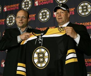
photo courtesy Elise Amendola/AP
The Boston Bruins unveiled two new aspects of the franchise on Thursday---a new coach and a new look.
Claude Julien, unjustly dismissed from his post as head coach of the 100+ point New Jersey Devils just before the playoffs, found a new home behind the bench with the struggling Bruins, who finished 13th in the Eastern Conference this past season. Julien proudly begins what will likely be a very short career in Beantown.
As for the uniforms, the Bruins became the first NHL team to unveil the new Reebok (RBK) Edge "uniform system" and logo re-design. Likely hoping to bring past glory back to Boston, the Bruins opted for slight changes to their color scheme and logos that recall the origins of the franchise.
The changes to the Bruins' uniform are worth analyzing in depth. First of all, the retired designs looked as such:
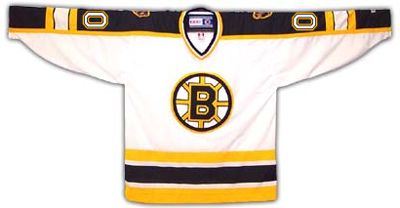
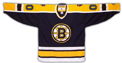
Simple enough, and one of the more tradition-friendly jersey styles in the NHL. The updated jerseys feature slight coloring changes, the addition of horizontal sleeve stripes, and a slightly modified primary logo:
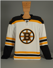
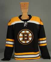
Notice that the colored panels on the shoulders no longer extend to the end of the sleeves, while an additional panel has been added to the chest just below the shoulders. On the dark jerseys, this panel is white. On the white jerseys, the panel is gold. This recalls a design not seen on Boston uniforms since the 1974-75 season.
Also different is the order of colors in the waist stripes. On the old dark jerseys, the colors are white-gold-white, and on the new jerseys they are gold-white-gold. A similar alteration appears on the white jerseys.
The most significant change has to be the horizontal sleeve stripes, though, which recall the design worn by Bobby Orr in this 1966 photo. In fact, Boston jerseys had horizontal sleeve stripes throughout the history of the team until 1995-96, when many other teams also changed their uniform designs following the lockout of the prior season. Any homage to historic and traditional designs is A-OK in my book, so I definitely approve of the changes so far.
While the sleeve stripes are a major change, a more subtle and interesting modification appears in the logos, both the primary logo and the shoulder patches. The new primary logo---the letter B among the spokes of a wheel---is largely the same except for the addition of serifs. This was actually the same style used by the Bruins starting in the early 1930s until 1948. A sans-serif "B" has been in use since then. As for the shoulder patches, they are a brand-new design altogether, but bear (sorry, had to) a similar appearance to the original Bruins team logo.
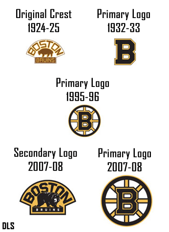
Apparently, the shoulder patch design will also be used as the "alternate" team logo in the event that the now-defunct third jersey option is re-instituted in the NHL in the coming years.
Oh, and I'm a big fan of the lace-up style collars. Very nice.
Overall, I highly approve of the Bruins' new look, in that it's really a very old look. Though many seem to think that constant reinvention is a good thing, nothing beats good, old-school hockey uniforms when it comes to athletics aesthetics. Hopefully the Bruins can emulate the teams of old in more than just appearance. Right now they suck pretty bad.
For further reading, Teebz over at Hockey Blog In Canada has already posted his reaction to the new Boston uniforms. I'm really anxious for the verdict on all the new NHL outfits from Paul at UniWatch in the coming weeks, which I'm sure will be fascinating.
UPDATE: Paul posted an extremely favorable review of the Boston uniforms today, along with a not-so favorable review of the Capitals, based on a leaked shot of the new jersey. I'll do a detailed analysis of every team's new digs in the coming weeks, so I'll save my opinion on Washington until later.


7 comments:
These are awesome. Love the ties, and hope the Avs do something good too.
I'll actually miss the third jerseys, I love the Avs third jerseys
I do too. So classic-looking.
Yep, nothing says "classic" like your Halloween costume from 2001.
nice article dbag. my little sister could right this article and it wouldn't have the bias bullshit in it either. go bruins
the bruins are one of the best and storied franchises in hockey (not just the NHL, all hockey) they had great names, titles, and jerseys asshole.
-an unbiased Leafs fan
sry gotta agree, red wings r better but the b's have had the best defense man of all time including lidstrom, chara. bourque, orr, and there were others...
-Red Wings fan
Thank you for sharing on this wonderful info with us, I learn more from your post.
Youth Hockey Uniforms
Post a Comment