

Jersey Redesign For The Washington Capitalszzzzzz...

On the first day of the NHL Entry Draft, last Friday, the Washington Capitals unveiled their new RBK Edge jerseys for public consumption. While Capitals fans seem to like them, I'm perfectly comfortable admitting my absolute lack of excitement for the new designs. They couldn't be more boring.
Everything good about the old-school Washington sweaters of years gone by and even the redeeming qualities of the most recent incarnations have been abandoned for a new, sterile and socceresque aesthetic.
Please, follow me on a quick stroll down memory lane with the Washington Capitals.
When the Capitals became an NHL team in 1974, they did so with one of the brightest, most recognizable uniform designs of all time---white pants. Sure, that ill-advised and never-duplicated fashion faux pas didn't last long (one season), but it was memorable, something that can't be said about the new RBK Edge uniforms.
For many years, the Capitals relied on the red-white-blue color palette for their team identity. With a few small variations, the jerseys and team logo remained fairly static. Below (in the order that they appear) is the road jersey from 1985 and the home jersey of 1993:
Not bad, but the horizontal stripes across the stomach tended to dominate a player's body and overpower the eye. And really, all those bright colors and the stars on the pants were a bit busy. Just too much to take in all at once. The various individual pieces of the uniform were solid as far as hockey designs go (horizontal stripes on the jersey, striped socks, blue pants), but not great all together.
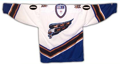
Nothing much changed for two decades until the lockout of 1994-95. The following season, like many other teams, the Capitals unveiled entirely new designs for their jerseys and team logo:
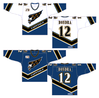
Both the white and the dark version featured the word "Capitals" written across the waist. The diagonal sleeve stripes and the odd crooked line across the lower half were a significant departure from hockey tradition, not to mention the long precedent set by the Capitals themselves.
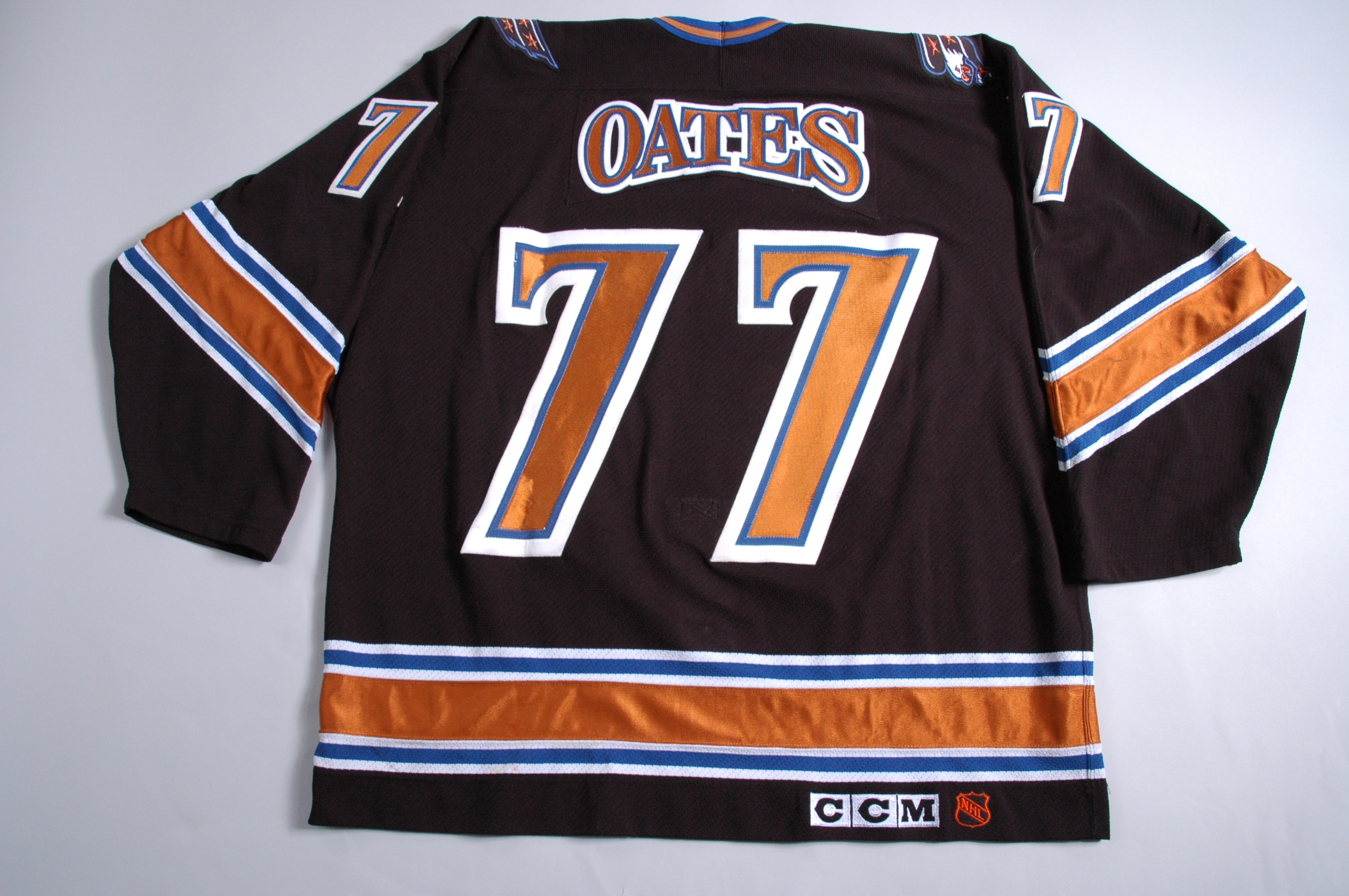
The home and away jerseys remained the sole options for the team until the 1997-98 season, when Washington introduced a new black jersey as an alternate (featuring truly unique arching for the nameplates):
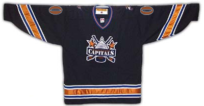
This black version became the primary dark jersey in 2000-01 (a white version was used in team practices). The already existing white jersey lost the word "Capitals" from the front but was still in use for home games. The long tradition of red, white and blue, stars and stripes, and all the other patriotic garb was obviously gone for good. What remained were cartoony logos featuring a diving eagle, the US Capitol dome and a couple of gold (bronze?) stars. Wearable, but nothing to write home about.
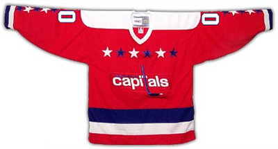
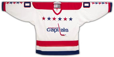
Now enter the RBK Edge.
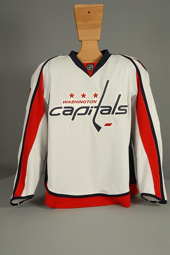
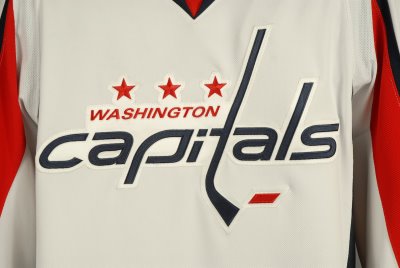
The red-white-blue scheme has returned, along with a modern take on the traditional Capitals logo (complete with hockey stick "t"), but minus most of the stars and the bold horizontal waist stripes of old. With the exception of a small red area at the bottom, all the stripes on the new white jersey are vertical, and dominate the sleeves.
The dark jersey is very similar, but is almost entirely red, a color already prominently worn by eleven other NHL clubs.

There's really not much going on with these new jerseys, and overall they're pretty dull. They're not offensive to behold like white pants and huge alternating color stripes, but they're not very memorable, either.
The only interesting feature of the entire new design is the shoulder patch logo, in which an eagle with outstretched wings creates a silhouette of the US Capitol Dome. Paul at Uniwatch thinks the patch looks too much like the Pontiac Firebird logo, but I don't think it's all that bad---especially since it's the only remotely exciting thing to be found.
Overall, a dull, fairly uninspired update for the Caps. Not that they had a lot to work with, mind you, but they could have come up with something a little more hockey-like and a little more eye-catching.
Teebz runs through the basic elements, and ultimately gives the new design a thumbs-up.
Can't say I agree with him, but it's not the worst route the Capitals could have gone, that's for sure.
For more photos, info and documentation concerning the uniform history of the Washington Capitals, see CapsJerseys.com.


11 comments:
I'm not a fan of Washington's home duds. In fact, I'm glad I don't live anywhere near Washington. Those red jerseys keep eating away at me.
The white road jerseys, though, are solid.
What did you think of the Islanders' leaked jerseys, DLS?
I'm reserving judgment on the Islanders stuff until they officially announce them. In that grainy photo of the potential new jersey, it looked like there were a dozen other versions in the room, and I don't want to jump all over it if that's not even the one they use.
That said, it looked pretty lame.
As for the Caps, I thought the league was going back to the "white at home" rule this season. Is that not true?
I like the shoulder patch a lot, even if it does look like something out of imperial Germany. Not sure why they chose to go with the throwback to a lame icon on the front if they had a design team good enough to come up with something like that.
Don't forget the inverted-arched nameplates they had on those black alts for one year. I don't think that's ever been done by any other team in any sport...
Billie,
Thanks, I totally forgot about that little detail. I found a photo online and linked it in the entry.
Thanks again, I always appreciate the help.
Nope. The NHL Board of Governors decided before the draft was held that dark jerseys will be worn at home. Status quo in the NHL.
That sucks. Everybody knows that the good guys are supposed to wear white.
The stars on the logo were not gold, but bronze.
This is what I said about the Caps jersey's in the Avs DB forums.. I pretty much stand by it. (I'm not a fan of the whites):
The Caps.. have piping problems in my mind. On the whites the blue piping under the arms and the rep sleeve piping really don't mesh well in my opinion. The whites, are just to busy. The Reds are much better, but i still don't like the white piping going all the way down the sleeve. why are the stars blue on the Whites, and white on the reds? In the same mold, why does the white jersey have a red stripe at the bottom of the jersey, and the red one has a red stripe? I really don't like how the t hockey stick seems to push the "C" off to the side.
... (a white version also briefly existed).
Actually, that white version is just a practice sweater. There has never been an official white version of the dome logo.
Thanks for the clarification. I'll make a note in the post.
Post a Comment